New BPS Logo Ideas
+8
Ghost Omel
Loganawe
Tassakahn
Arbiter 617
AnimeFreak1540
Sgt Rorschach
Turretguy36
CordlessJet
12 posters
Page 1 of 2
Page 1 of 2 • 1, 2 
 New BPS Logo Ideas
Hey everyone,
So part of the new renovations coming to Black Plasma Studios is an entire overhaul of the design. When I came up with the name years ago, I just googled for "black plasma" and found one of the first images. I've used it ever since.


However, I've always felt it was a beat cheap, and literally unoriginal. So I'm as the first part of the new BPS design, I want to focus on this logo.
One thing I noticed with popular logos is that nearly all of them can be drawn with just two colors, and often are simple shapes and lines:
http://designsphere.info/wp-content/uploads/2013/02/2662264721_48198d9e77_b.jpg
The reasons for this are many. First of all, simple designs stay in the viewer's head better, and are more memorable. Also, recreating the design is easy to do almost anywhere.
So I started creating silhouettes- just black and white ideas of what the new logo might look like. Once I choose a logo we will get into coloring and placement of the text.
What I was going for what to create somewhat of the original shape of the plasma ball I've been using. I've been trying to have six different points in all my designs, since six is my lucky number and I just think it works well. None of these designs involve text, which is where I should probably look to next.
I'd like to hear feedback on these logos, and any ideas of other things to do. If you're a graphic designer, I'd love to SEE your ideas! I'm open for almost anything. I don't plan on sticking to this six-sided thing forever if I can't get a good look.
Also keep in mind I need this logo to look good even when it's very small, such as on the corner of a YouTube thumbnail.





Now I'm playing around with the color pallete a bit. See anything you like?

Now I'm playing with fonts, as well as some more color pallets. Here the logo is more of a placeholder, and I'm experimenting with the text and colors.


Played around a LOT more today. Literally I have sheets of paper just sprawled out across my floor of different ideas now.


Took one of those designs that I made earlier and worked it up a bit with different color ideas. Just throwing a bunch of colors side-by side for comparison!



After trying to get adjusted to this design for awhile, I'm very comfortable with the way it looks. I took the six rings off around the edge. However, I'm having a lot of mixed opinions between whether to use the dark purple or the teal. I made an image which shows the logo in context of the channel page for both colors.
Please tell me which you prefer!


So part of the new renovations coming to Black Plasma Studios is an entire overhaul of the design. When I came up with the name years ago, I just googled for "black plasma" and found one of the first images. I've used it ever since.


However, I've always felt it was a beat cheap, and literally unoriginal. So I'm as the first part of the new BPS design, I want to focus on this logo.
One thing I noticed with popular logos is that nearly all of them can be drawn with just two colors, and often are simple shapes and lines:
http://designsphere.info/wp-content/uploads/2013/02/2662264721_48198d9e77_b.jpg
The reasons for this are many. First of all, simple designs stay in the viewer's head better, and are more memorable. Also, recreating the design is easy to do almost anywhere.
So I started creating silhouettes- just black and white ideas of what the new logo might look like. Once I choose a logo we will get into coloring and placement of the text.
What I was going for what to create somewhat of the original shape of the plasma ball I've been using. I've been trying to have six different points in all my designs, since six is my lucky number and I just think it works well. None of these designs involve text, which is where I should probably look to next.
I'd like to hear feedback on these logos, and any ideas of other things to do. If you're a graphic designer, I'd love to SEE your ideas! I'm open for almost anything. I don't plan on sticking to this six-sided thing forever if I can't get a good look.
Also keep in mind I need this logo to look good even when it's very small, such as on the corner of a YouTube thumbnail.


Now I'm playing around with the color pallete a bit. See anything you like?

Now I'm playing with fonts, as well as some more color pallets. Here the logo is more of a placeholder, and I'm experimenting with the text and colors.


Played around a LOT more today. Literally I have sheets of paper just sprawled out across my floor of different ideas now.


Took one of those designs that I made earlier and worked it up a bit with different color ideas. Just throwing a bunch of colors side-by side for comparison!


After trying to get adjusted to this design for awhile, I'm very comfortable with the way it looks. I took the six rings off around the edge. However, I'm having a lot of mixed opinions between whether to use the dark purple or the teal. I made an image which shows the logo in context of the channel page for both colors.
Please tell me which you prefer!


Last edited by Arbiter 617 on Mon Dec 01, 2014 10:14 pm; edited 16 times in total
 Re: New BPS Logo Ideas
I really like the last one on the second to last line! 

CordlessJet- Posts : 4
Join date : 2014-10-23
Location : BRITAIN BRUV
 Re: New BPS Logo Ideas
You know what could be cool? You could get a Halo: Reach model of a Mark VI Spartan, make him black everywhere, and have his hand palm up, with a ball of black plasma levitating above it.
So, the spartan itself could be a silhouette, and the plasma ball could even be giving off a light or something to make it stand out?
So, the spartan itself could be a silhouette, and the plasma ball could even be giving off a light or something to make it stand out?

Turretguy36- Posts : 7
Join date : 2014-10-25
Age : 31
Location : Canada
 Re: New BPS Logo Ideas
As far as designs go, here are the ones I like:
Column 4 Row 2
Column 4 Row 3
Column 3 Row 5
Although, to be perfectly honest, the ball of plasma has become our thing now. You've edited the original image, so its not like you did 0 work on it. If you still feel weird, I'd just edit the image some more until you feel that its become more of your creation than someone else's.

Sgt Rorschach- Posts : 10
Join date : 2014-10-24
Age : 30
 Re: New BPS Logo Ideas
I don't know about anyone else but some of these look like there are flowers in some of these ideas. Besides that, they all look nice so its hart to choose.
 Re: New BPS Logo Ideas
AnimeFreak1540 wrote:...some of these look like there are flowers...
Yeah I've been seeing those too and it's really irritating. xD
The good news is with color, and on top of another image, that flower effect will fade a bit. But I'm leaning towards the ones that don't have such a strong flower illusion.
 Re: New BPS Logo Ideas
How about just having a purple square background and the black symbol? I personally think the white versions look best.

Tassakahn- Posts : 64
Join date : 2014-11-07
Age : 27
Location : UK
 Re: New BPS Logo Ideas
Some BPS logo concepts (I used the design I liked the most, I did not try the others). I think they look alright for the amount of time spent (I like the last 2 the most, first two are very similar).


Loganawe- Posts : 5
Join date : 2014-11-28
 Re: New BPS Logo Ideas
Updated the list, includes new ideas!
Yeah Logan I like the glow effects! I'll definitely have to have a lot of fun with the effects once I get a design I'm happy with
Yeah Logan I like the glow effects! I'll definitely have to have a lot of fun with the effects once I get a design I'm happy with
 Re: New BPS Logo Ideas
Im digging the Middle one in your last edit, though i would keep the original purple violet scheme, its a trademark of sorts.
Ghost Omel- Posts : 18
Join date : 2014-10-22
 Re: New BPS Logo Ideas
Updated stuff with what you did (Of my favorite), I think it looks the best with the text under and not beside.


Loganawe- Posts : 5
Join date : 2014-11-28
 Re: New BPS Logo Ideas
Also sorry for the size, but for some reason, I can post the images just fine, but when I try to change the size, it says I cannot post links for 7 days after registering. (With the insert an image)

Loganawe- Posts : 5
Join date : 2014-11-28
 Re: New BPS Logo Ideas
Yeah that's a forumotion thing.
I really like those logo edits, particularly the first and second of your first set. So damn shiny.
I really like those logo edits, particularly the first and second of your first set. So damn shiny.

Tassakahn- Posts : 64
Join date : 2014-11-07
Age : 27
Location : UK
 Re: New BPS Logo Ideas
Logan which font are you using? I'd like to start comparing fonts as well.
I used to use Calibri, but for these I'm using Gills San, condensed for BLACK PLASMA and default for STUDIOS. Neither are bold.
Also I made a version of the newest logo with glow and stuff.
I used to use Calibri, but for these I'm using Gills San, condensed for BLACK PLASMA and default for STUDIOS. Neither are bold.
Also I made a version of the newest logo with glow and stuff.
 Re: New BPS Logo Ideas
For the "Black Plasma" text I am using a font called Bebas Neue Regular, it is free you can just search it up, it is one of my favorite fonts. For "Studios" I am using "Antonio Regular" (on the regular setting). Also if you use photoshop I set the text ot sharp.

Loganawe- Posts : 5
Join date : 2014-11-28
 Re: New BPS Logo Ideas
Also for the new things you posted, I like the one with glow quite a bit but it looks a bit grainy when I open it up.

Loganawe- Posts : 5
Join date : 2014-11-28
 Re: New BPS Logo Ideas
I like the Bebas Neue.
And yeah don't worry about the quality yet. I'm jumping the file around between software changing colors, cropping, effects, etc. I'm just trying to get a feel for it in low res.
And yeah don't worry about the quality yet. I'm jumping the file around between software changing colors, cropping, effects, etc. I'm just trying to get a feel for it in low res.
 BPS LOGO REPLY
Arby heres what i got for ya. You have tryed some out and posted them. Now on the selection you showed us on wednesday we could see a few of your ideas and without a doubt i think the logo with black background and a glow around it makes a nice effect and it makes the logo have a warm feeling, makes it stand out almost.
 Re: New BPS Logo Ideas
Updated the original post, this should be the last update.
It's a battle between teal and purple now: WHICH DO YOU PREFER?
Also Bebas Nueue or whatever it was called isn't available in Vegas or Word by default I don't think. What I like about Gill Sans is that it's in Word, Vegas, AE, and most other places. So it's easier to recreate the feel.
It's a battle between teal and purple now: WHICH DO YOU PREFER?
Also Bebas Nueue or whatever it was called isn't available in Vegas or Word by default I don't think. What I like about Gill Sans is that it's in Word, Vegas, AE, and most other places. So it's easier to recreate the feel.
 Re: New BPS Logo Ideas
The teal one is nice. As long as it's not neon pink, it's all good.

Tassakahn- Posts : 64
Join date : 2014-11-07
Age : 27
Location : UK
 Re: New BPS Logo Ideas
I like the purple, but maybe a brighter shade?

GuyHigh- Posts : 2
Join date : 2014-10-22
 Re: New BPS Logo Ideas
Either is nice but if it stays 50-50 then there could be a nice way to combine the 2 colours.
Page 1 of 2 • 1, 2 
Page 1 of 2
Permissions in this forum:
You cannot reply to topics in this forum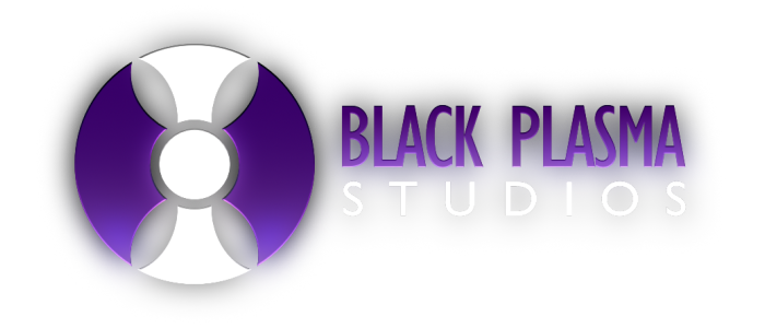
 Home
Home


